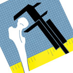
When I made the original Mac-only Anthropomotron, I had to make its icon as well. Back then I thought it would be neat to make an ‘A’ shape using a femur and calipers. The result was this:

As I’ve said before, a lot has changed since 2004. Icons nowadays are even fancier and the old Anthropomotron icon was barely acceptable even for that time. I decided that I would take another stab at making the Anthropomotron icon.
Apple has written icon design guidelines for iOS apps (and one for Mac icons). They’re a fascinating read for those interested in graphic design. They emphasize a sort of shiny realism: realistic elements but simplified. I’ve also liked the generic Mac app icon, which also has an ‘A,’ with a ruler as the crossbar. One of the things i didn’t like about the old Anthropomotron icon was that it didn’t look definitively like an ‘A.’ It kind of looks like an ‘R.’ For the new icon I decided to add a clearer crossbar, adding a ruler to the picture. I drew the concept and scanned it into Illustrator:
![]() I was happy that my drawing skills have improved since 2003. But, there are a few problems. While the proportions are realistic, the legs of the ‘A’ are very thin. If the entire ‘A’ is visible, the shapes become ambiguously small.
I was happy that my drawing skills have improved since 2003. But, there are a few problems. While the proportions are realistic, the legs of the ‘A’ are very thin. If the entire ‘A’ is visible, the shapes become ambiguously small.
![]()
Also, I’m used to the comic art style, which has black outlines defining the shapes. That’s not realistic. I tried to solve these two issues by removing the outlines in Photoshop and zooming in the image so the ruler is along the bottom edge of the image:
![]()
I thought this was better, but it’s still missing something. It seemed to lose a lot of its ‘A’-ness in this alignment. A little frustrated, I grudgingly went to bed. After a few minutes of laying there, I bolted out of bed, fired up Photoshop again, and did this:

Tilting everything worked! I saved that, and slept like a baby. The next day I worked towards making the final draft of the icon. I made the blue and yellow match the actual colors in the app. Then I added some textures to the three elements (wood, metal, and actual femur texture), and some gradients and shading for depth. This is the final Anthropomotron icon for iOS:
![]()
Next: a step backwards for the Android icon!
That’s some nice work Lou, but wouldn’t it look better if an octopus was holding the calipers and a raccoon was gnawing on the femur… and they were gazing into each other’s eyes longingly? mmmm… interspecies sexual tension at the dig site
That’s what I image ten years of conversation distilled into one sentence would sound like.