Over the pass few weeks I’ve had two separate sets of experiences that have many similar elements. One set was the preparation of slide presentations for my dissertation defense and later the Midwest Conference for Andean and Amazonian Archaeology and Ethnohistory (MCAAAE). The second set was the drawing and coloring page ten of Keeley: Comic Hero Extraordinaire. The common element I found was that in both activities, one of the most important considerations is that the presented sequence of information flows in an easily-interpretable order. In presentations, one slide has to flow to the next to accurately convey the intended point. In comics, the sequence of panels have to tell the story as the creator envisioned.
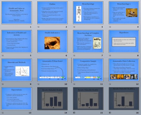
Looking first at the presentation aspect, let’s focus on the background section of my defense presentation, the parts that lead up to the results and conclusion. Given half and hour, my goal was to present a summary of my research journey. The audience was primarily my committee of five professors, all of whom familiar with my dissertation. The sequence is presented linearly from general to specific: I started at the anthropological question I had, then a description of the theories underlying research in this question, then my hypotheses given what previous research suggested, followed by the geographic region I studied, and lastly the indicators of health I used to to test the hypotheses.
This presents one possible logical flow of information. However, I found that this sequence did not work for my next presentation. One of my advisors suggested that the MCAAAE attendees would better appreciate a talk that focused on the health indicators, since the audience was more familiar with the underlying archaeological theory but did not know as much as I did about the use of health indicators in bioarchaeology. Examining the defense presentation, it was clear to me that the old order of information would not work for such an audience. I would break their train of thought when I transitioned from bioarchaeology (something less familiar) to the Andean region (a much more familiar topic for this conference!) back to the health indicators (another less familiar topic). Also, the two less-familiar topics are related. I chose to reorder the slides so the health indicators are described after the general description of bioarchaeology, and before the section about the Andean region.
This sequence would put the less-familiar topics together so, combined, they help clarify each other, and then head into a less involved section so the audience can digest the new information. I also changed the background so people who saw the defense presentation would not be staring at the exact same slides.
Long story short, the presentation was a success and I received several comments that my talk was easy to follow and kept their interest. Success!
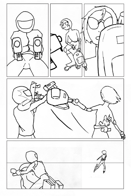
I encountered the same type of decision making as I was working on comic pages. In the pages I was working on at the time, Keeley is involved in a chase scene with a villain. Keeley’s car is sent careening down and offramp, where it rolls to a stop in a field in the middle of St. Louis (which totally exists in real life!). Keeley crawls out of her car and is confronted by the villain. In the section I’m focusing on in this post, Keeley gets the upper hand and runs across the field, with the villain restarting the pursuit. I knew this sequence of events of course, but looking at the actual page of drawings, the panels are not clear:
In the fourth panel (the wide one at mid-page), Keeley is hitting the villain with her backpack and by the next panel, Keeley is several yards away and the villain is on her motorcycle. So what happened in between? The most reasonable assumption, and the right one, is that Keeley took off running while the villain got back on her motorcycle. But, for the reader, there are many other possibilities. Did she walk, run, limp, or do a backflip to her bike? Also, what happened to the guns the villain was holding? Without limiting these subtle but meaningful possibilities, the reader has to stop to consider the sequence of events and leaves the story (Scott McCloud’s Understanding Comics and Creating Comics have good sections about panel sequencing and reader interpretation).
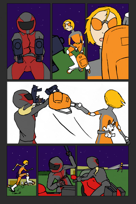
On viewing the page as a whole, I decided it did not work. I had to change the page to make the sequence of events more explicit in showing what I had in mind. The following shows the final layout of page 10, in progress with flat colors but no shading or lettering:
At the bottom row of the page, I added two small panels to show what happens in between the two original panels. In one, there is a closeup of Keeley running, with her saying something about her plan to get back on the freeway. In the second panel, the villain is shown stumbling to her motorcycle (a side-detail for the observant is that she is opening one of her motorcycle’s storage boxes to put one of her guns away to explain her pose in the next panel). This version, to me as I consider the audience, is a lot more clear and keeps the reader in the flow of events in this fast paced scene.
I enjoyed how two aspects of my life had the same lesson to teach me. As I worked on both presentation-making and comic-making in the past weeks, they really helped each other develop into something better than if I had worked on one exclusively. Both activities are continuing: I have to make a presentation for the SAA meeting in a few weeks, tailoring my talk to another type of audience, and hopefully I’ll have several pages of Keeley comics to show here when I finish coloring page ten.


Good points. I’ve often noticed a lot of overlap between my different projects. Skills from one discipline are often applicable (and underapplied in general!) in another. Never thought about presentations as a comic book though. Very interesting.