My winter break project this year was replacing graphics in my lectures that I didn’t like. Each semester, I wince a little at certain points when an illustration from the Internet is the best available, but still flawed in some way. Some of these illustrations have typos in them. Others are low resolution, which is especially glaring with the fancy projector at one of my schools. Here is what I have done:
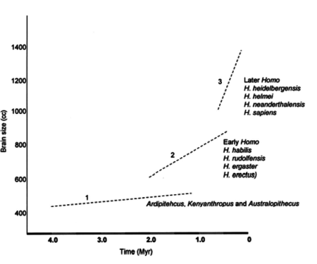
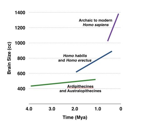
- Drew over graph of hominin cranial capacities. Reason: there are typos in the names. Also, the original uses the many ‘splitter’ names for different hominins while my class is a ‘lumper’ zone with fewer but safer names. I made the text larger and color coded the lines too.
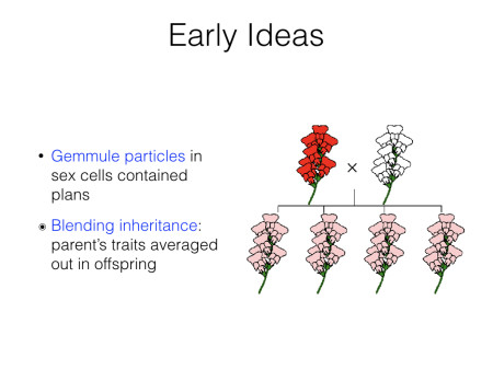
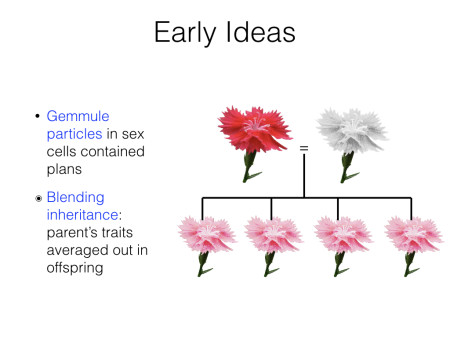
- Made my own chart of blending inheritance. Reason: found illustration was very pixelated. I used a photo of a red flower from Wikicommons and made white and pink versions for my chart. The higher photorealism reduces clarity a little, but the boost in resolution is worth it. I also made the symbols match the cultural anthropology kinship chart.
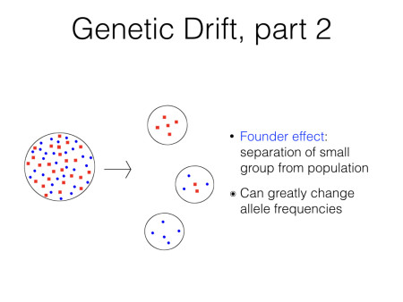
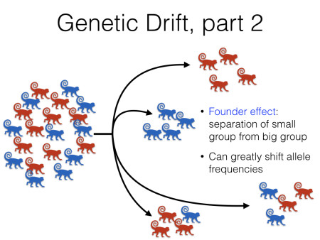
- Made a new graphic for founder effect. Reason: I used a common Internet picture of just different shapes, which looked terrible. Keynote has great vector objects, including a monkey, so I used that to make my own illustration of founder effect. Since I made it within Keynote, I could really use the slide space and holy shit it looks gorgeous.
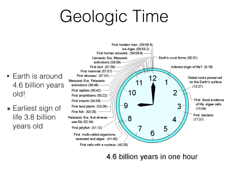
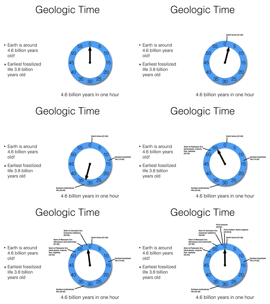
Made my own geologic time clock. Reason: This was another case where the best Internet graphic still had deep flaws. This one had too much text, the labels are also incorrect for a few of them, pointing to a different place on the clock relative to what the text says, and the text is small and pixelated. Also, why does this hour-long clock have an hour hand that shows nothing?
My version makes the clock less clock-like but focused on the purpose of conveying one hour in the circle. Since I made the clock myself out of individual elements in Keynote, I could also have the slide step through each event with the hand rotating along instead of hitting the class with everything at once. All of it is done using Keynote’s image tools, transitions, and build order. Keynote has great graphical capability with a large library of vector art that was introduced in a recent update as well as flexible line drawing.
Flipping through the slides, nothing else caught my eye as needing a change. Maybe there will be other things that bug me this semester. At least there will be less wincing.
By the way, here is a little presentation tip: having bullet points come in one at a time is great for lecture since everyone is focused on the same part of the slide. That’s not the tip. The tip is that I make the last bullet slightly different (â—‰) to let me know that there are no more bullet points on that slide. Once I see that, I know that the slide is almost done with no surprises showing up that I forgot about.
