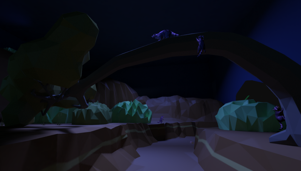
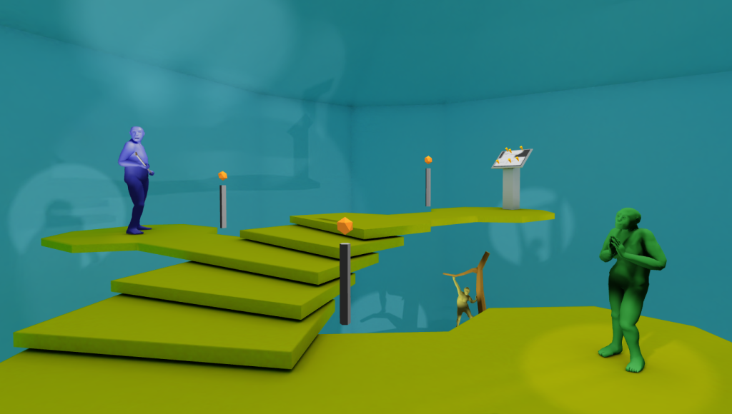
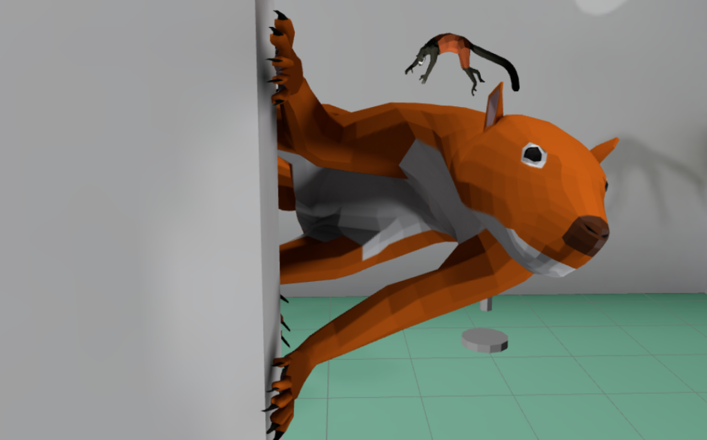
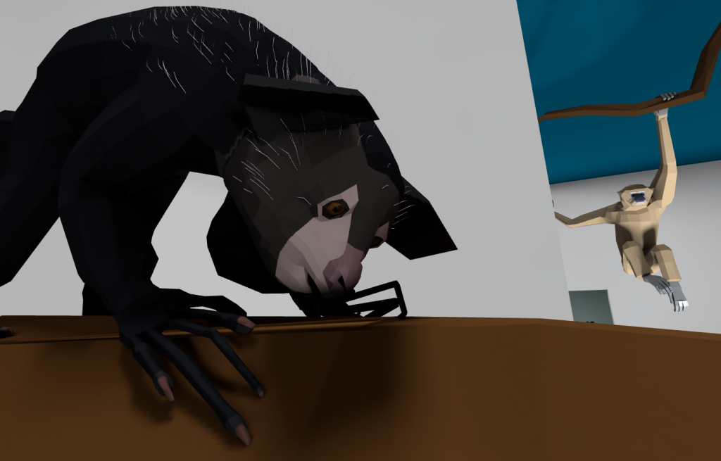
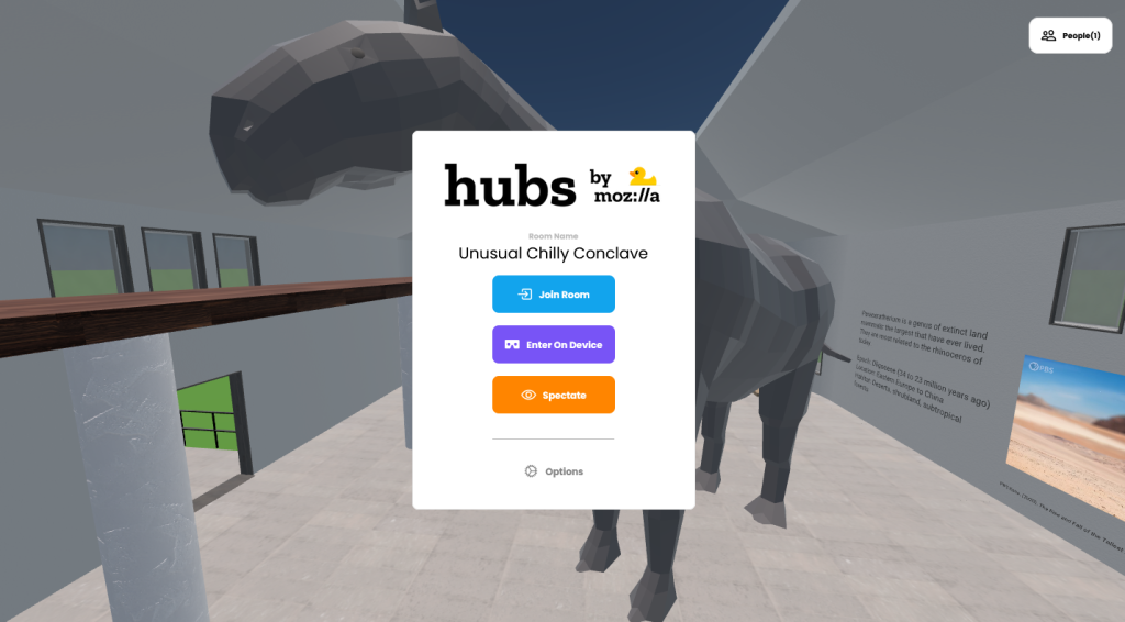
DoDeca-Con!

May 21st, 2012

Two weeks ago, a few friends were going to be at DoDeca-Con both as artists and visitors, so I bought a weekend pass and planned on stopping by for a little bit. As it turned out, I had such a good time that I spent hours there on each day!

DoDeca-Con is a new local comic created by comic creator Randy Taylor. This year was the first ever, and it was very well executed.

When I got to Columbia’s Kemper Arena (not the Kansas City one!) I was surprised at the small size of the building. After all, the only other Con I’ve been to was the San Diego Comic-Con, the biggest! In contrast, DoDeca-Con took place in a single room fit for a wedding reception. Still, as I walked around I noticed a great use of space. There were the same features of a larger Con, just shrunken! There were vendors set up near the entrance and artists were lined along the long wall, wrapping around the far side. To the left of the entrance was a good concession stand. In the back there was even a curtained off area for panels!

Over the course of the day I wandered through each section. It was fun hanging out with my friends who had tables set up showing off their art. I browsed comics and action figures at several of the vendor booths, most notably those run by Category 5 Comics and Games of St. Louis and The Antiquarium in Jefferson City. I left with a lot of affordable stuff and the vendors were also great to talk to.

Later in the afternoon on Saturday I went to a panel held by some of my friends. I took video with my iPhone but I kept running out of space. I got around half of the hour-long discussion and I’ve put them on Youtube:

I had a chance to chat with Randy when things were winding down on Sunday. He seemed pretty happy with how the Con turned out and is already planning for next year. Maybe I can get my own table with a new comic to show off by then!

Note: The Midmococo site also has an account of events.


The Making of an Icon, Part 2

May 16th, 2012

After I made the iOS icon, I thought that making an Android version of Anthropomotron would be a good idea as well. Coverting the code to work on Android was relatively painless. When I got to adding the icon, though, I saw that the Android icon design guidelines were very different from the Apple ones. In fact, some of the statements between them are complete opposites. Android icons should not be shiny and should use background transparency to make a unique shape. Apple icons should be shiny but have a square shape (which an algorithm will take and round the corners).

My conclusion was that I needed yet another new icon for the Droid version. Looking at their suggestions, they specifically do not want a cut-off object in the icon, so I went back to the full ‘A.’ They didn’t want subtle gradients and shading so those were gone. To give the icon a unique shape, I made the blue background a smaller square than the rest of the elements, so the femur and calipers stick out from the top and bottom, using transparent areas:


The Making of an Icon, Part 1

May 14th, 2012

When I made the original Mac-only Anthropomotron, I had to make its icon as well. Back then I thought it would be neat to make an ‘A’ shape using a femur and calipers. The result was this:

As I’ve said before, a lot has changed since 2004. Icons nowadays are even fancier and the old Anthropomotron icon was barely acceptable even for that time. I decided that I would take another stab at making the Anthropomotron icon.

Apple has written icon design guidelines for iOS apps (and one for Mac icons).They’re a fascinating read for those interested in graphic design. They emphasize a sort of shiny realism: realistic elements but simplified. I’ve also liked the generic Mac app icon, which also has an ‘A,’ with a ruler as the crossbar. One of the things i didn’t like about the old Anthropomotron icon was that it didn’t look definitively like an ‘A.’ It kind of looks like an ‘R.’ For the new icon I decided to add a clearer crossbar, adding a ruler to the picture. I drew the concept and scanned it into Illustrator:

I was happy that my drawing skills have improved since 2003. But, there are a few problems. While the proportions are realistic, the legs of the ‘A’ are very thin. If the entire ‘A’ is visible, the shapes become ambiguously small.

Also, I’m used to the comic art style, which has black outlines defining the shapes. That’s not realistic. I tried to solve these two issues by removing the outlines in Photoshop and zooming in the image so the ruler is along the bottom edge of the image:

I thought this was better, but it’s still missing something. It seemed to lose a lot of its ‘A’-ness in this alignment. A little frustrated, I grudgingly went to bed. After a few minutes of laying there, I bolted out of bed, fired up Photoshop again, and did this:

Tilting everything worked! I saved that, and slept like a baby. The next day I worked towards making the final draft of the icon. I made the blue and yellow match the actual colors in the app. Then I added some textures to the three elements (wood, metal, and actual femur texture), and some gradients and shading for depth. This is the final Anthropomotron icon for iOS:

Next: a step backwards for the Android icon!


The Memphis Zoo

May 3rd, 2012

I wasn’t planning on seeing any sights on my own, but the travel guide in our hotel room mentioned that the Memphis Zoo won some national award. looked through their website but didn’t find what award they earned, but I was hooked on the idea of visiting. Also, their list of animals on display was enormous.

On Saturday I borrowed Derek’s car and drove about 10 minutes to the zoo. The city was strangely empty around that time, but the zoo was already pretty packed at 10:30 in the morning. The entrance had a Hollywood-Egypt feel (I guess it taps into Memphis’s Egyptian namesake?). It was impressive enough for me to use the Photosynth panorama app to take a picture though:

By the way, I didn’t think I would be doing any major sightseeing so I didn’t bring my usual camera. All I had was the iPhone which did an OK job, but man would the Canon have been more appropriate! I really underestimated this zoo.

Near the entrance was the Animals of the Night exhibit. The building housed a surprisingly great number of exhibits in lowlight to simulate nighttime for the animals. In the center was a long enclosure for bats, while on the periphery there were more bats (for example, vampire bats), snakes, aardvarks, wombats, bushbabys, lorises, hedgehogs, kiwis, and so on.

{ A keeper feeds a bat that had landed on her cap. }

While I was there two keepers entered the central bat area and gave a demonstration of bat feeding.

I spent a lot of time in that area and I thought it was worth the $15 + $5 admission. The rest of the zoo had some really nice exhibits. I went north towards the pagodas in the distance. (I noticed that many exhibits had architecture reminiscent of the animal’s home territory. For example, the tiger exhibit was bounded by walls in the Khmer style.)

Back to the story, the Chinese section of the zoo featured pandas. In San Diego, the pandas seem to be fairly languid and there is a very structured system to get visitors moving along. In Memphis, the pandas are in an ordinary exhibit and when I was passing by, one of the pandas was very active. It ambled around on the grass, before climbing its treehouse. There, it started urinating, lifting one leg, then the other. Still urinating, the panda did a handstand (!). After that, it got back on all fours and did this:

I kept walking past the panda enclosure when lights turned on to my left.I looked and saw what can only be described as a panda chill den. The same panda from before entered the den and started chowing down on some bamboo that a keeper had left there. I was mere feet from a panda!

I went all over the zoo before heading back to the hotel. The zoo is actually pretty small and I was out by two that afternoon. Some exhibits were very old (the aquarium is from 1959 and it shows) but overall I was very impressed and I had a great time. The photos I took are below!


IMG_0283 IMG_0206 IMG_0208 IMG_0209 IMG_0210 IMG_0211 IMG_0213 IMG_0214 IMG_0215 IMG_0216 IMG_0217 IMG_0218 IMG_0219 IMG_0220 IMG_0221 IMG_0222 IMG_0224 IMG_0225 IMG_0226 IMG_0227 IMG_0228 IMG_0229 IMG_0230 IMG_0231 IMG_0232 IMG_0233 IMG_0234 IMG_0235 IMG_0236 IMG_0182 IMG_0237 IMG_0183 IMG_0240 IMG_0241 IMG_0244 IMG_0245 IMG_0247 IMG_0248 IMG_0249 IMG_0250 IMG_0251 IMG_0252 IMG_0253 IMG_0254 IMG_0255 IMG_0256 IMG_0257 IMG_0188 IMG_0282 IMG_0281 IMG_0258 IMG_0259 IMG_0260 IMG_0261 IMG_0262 IMG_0263 IMG_0264 IMG_0265 IMG_0266 IMG_0267 IMG_0268 IMG_0269 IMG_0271 IMG_0272 IMG_0273

Update: Here is the other Youtube movie of my zoo trip!


My Trip to the 2012 SAA Meeting

April 30th, 2012

I took some time off work to go to this year’s SAA meeting. This year the conference was in Memphis, which is only a six hour drive away. I travelled in a caravan of MU students, which was a fun little road trip even though the caravan of two split up before even leaving town. Still, we all made it to Memphis at roughly the same time on Wednesday evening.

{ Crossing the Discovery Bridge to St. Louis. }

My poster session was on Thursday and 8AM. I thought the poster room was a little out-of-the-way, but when considering the whole layout of the conference, it was in a good spot (also, last year in Sacramento the poster was in one of the main corridors, which is hard to beat in terms of visibility).

{ My poster and I. }

I had a lot of good responses to my poster. Harris lines seemed to interest a lot of people, but I think it’s too below the radar for most people to critique (besides the small sample sizes of course). The poster next to mine had an example of a cancerous lesion on the cranium that bore a striking resemblance to one I found in the Armatambo collection. I felt bad for leaving my poster so I didn’t get to see many of the others in my section.

{ We also took the trolley to get fried chicken. }

Unlike previous years, there seemed to be a more coordinated attempt to cluster similar topics on certain days. Andean bioarchaeology was done by the end of the first day, and bioarchaeology in general petered out by Saturday. I actually like the schedule this way because there’s less guilt for spending a day away from the conference, for example going to the Memphis Zoo, which was amazing.

One emerging problem I noticed in this year’s SAA was that most sessions were running late. It was annoying to leave the talk of someone I wanted to see for another talk I wanted to see more, only to find that the second room was running later and I could’ve seen both talks! I heard one session was running a full hour late and that’s terrible (good thing I was at the zoo!). I could’ve sworn that things were more on time last year… in fact here is a quote from my blog entry for the 2010 SAAs: “Most panels ran like clockwork.” I hope next year there will be a return to punctuality. The meeting will be in Hawaii, so if anything all talks will end early so important adventuring can take place.